
CSS Note

Basic
特殊关键字
如 inherit initial unset 这三个属性值,在任何属性中均可用。
选择器
我们可以通过添加 class 或者 id 的方式来选择特定的元素为它添加特定的样式。
1 | .class { |
根选择器
:root
在 HTML 文件中通常是 <html> 元素,具有全局性和高优先级。
适合定义 CSS 变量。
为什么不使用 * 来定义变量呢?
- 性能问题:通配选择器会匹配文档中的每一个元素,可能会影响性能,尤其是在大型文档中。
- 优先级较低:通配选择器的优先级较低,定义在其中的变量可能会被其他样式覆盖。
- 语义不明确:使用
*来定义全局变量不够直观,无法清楚表达这些变量是全局的,可能会导致混淆。
类
一个元素可以有多个类名,在引号内用空格隔开。
这时我们想选择既是这个元素同时还有这个类名,那么可以这样写:
1 | body.class { |
注意这里两者之间没有空格。
当两者间有空格时,代表 .class 是 body 的后代中的一个类。
表单元素
值得一提的是,表单元素的默认样式会覆盖掉默认继承的样式,需要设置为 inherit。
Var
CSS 变量。
变量使用 -- 开头,并通过 var() 函数调用。
可以添加默认值,当该变量未定义时,便可以使用默认值。
1 | body { |
Color
1 | color: [color]; |
color 可以是色名,可以是 rgb,可以是 rgba,可以是十六进制数。
Font
导入字体。
1 | @font-face { |
url 填写字体文件的本地地址/云端地址。
导入后为它设定一个 font-family(好听的名字),
然后就可以调用它了。
Margin
外边距。
1 | margin: [length|percentage|auto] |
值有四个,顺序为上右下左,当某位置没有时将按照它对位的间距同步。
如只有两个值时,第一个代表上下外边距,第二个代表左右外边距。
下图为经典盒模型。
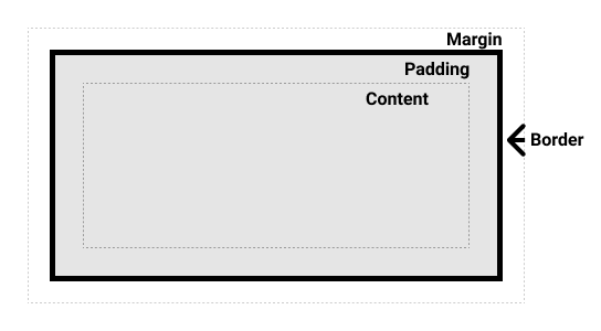
Padding
内边距。
即内容到 border 之间的空间。
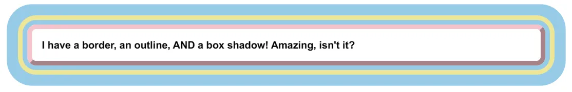
Border
边框,其外是 margin 其内是 padding。
1 | border: [width] [style] [color]; |
具体的长度单位可以见CSS 的值与单位 - 学习 Web 开发 | MDN (mozilla.org)
style
none:去除hidden:隐藏,不占用空间,但在表单中可能有特殊行为dotted:圆点dashed:虚线solid:实线double:双实线groove:雕刻ridge:浮雕inset:陷入outset:突出
颜色就不必多说了。
border-radius 属性可以改 border 的圆角大小。
MDN 样例:
1 | div { |
需要注意的是,border 是有体积的,并且会随着缩放而变化,所以如果要计算宽度需要格外注意。
所以如果想固定盒子的实际大小的话,可以使用替代盒模型。
1 | .box { |
这样盒子的实际大小完全由 width 和 height 来决定,减去 padding 和 border 即为 content 的大小。
如果想全局都使用此模型,可以这样写:
1 | html { |
渐变边框:
1 | border-image: <source> <slice> / <width> / <outset> <repeat>; |
比较推荐的做法是盒子嵌套一下,外面整上 padding 模拟边框。
Opacity
透明度,该元素及其后代元素的透明度都会受到影响,若不想后代元素受到影响,可以通过 background-color 来调整背景透明度。
Outline
与 Border 类似,但是不占用空间,属性值为 大小、颜色、样式,顺序不重要。
outline-offset 用来设置元素边缘与 outline 之间的间隙。
Shadow
Box
1 | box-shadow: [inset] [x-offset] [y-offset] [blur-radius] [spread-radius] [color]; |
第一个参数为可选项,加上 inset 即为内阴影,不写时默认为外阴影。
Text
1 | text-shadow: [x-offset] [y-offset] [blur-radius] [color]; |
与 box-shadow 类似。
shadow 可以重叠,用 , 隔开即可。
Text-decoration
1 | text-decoration: [underline/overline/line-through] [color] [style] [thickness] |
示例:
1 | text-decoration: underline #ff7d31 solid 3px; |
Float
使一个元素浮动在容器的某个位置,行内元素可以环绕它。
1 | float: left/right/none/inline-start/inline-end; |
Clear
可用于清除浮动。
Overflow
处理溢出的元素。
visible:内容不被裁剪。hidden: 裁剪使其适应溢出,不支持滚动。clip:裁剪,代码层面不支持滚动。overflow-clip-margin:裁剪范围。
scroll:总显示滚动条auto:若不溢出则不显示滚动条,否则显示。
Background
改变你的网页背景
可以通过 background 同时添加多个属性值,也可拆分来写。
1 | background-image: url(); |
background-repeat
repeat-x/repeat-y:可以控制横向还是纵向重复,也可以使用双值分别为不同的重复样式。repeat:重复填充背景,溢出部分将裁剪。space:不会裁剪,第一个和最后一个图像会贴合边缘,使空白均匀。round:通过拉伸图像使得重复填充no-repeat:不重复。
background-position
关键字:center/top/left/bottom/right
指定为对应边界中间位置。
也可以采用两个值分别对应 x/y 坐标。
background-size
length:可以是一个值也可以是两个值。percentage:可以设置相对于内容和内边距的百分比。auto:自动缩放。cover:使背景覆盖。contain:使包含背景。
Display
设置元素的外部显示类型。
block:块级元素。inline:内联元素,无法应用宽度/高度属性。inline-block:内联元素,但可以应用宽度/高度属性。none:清除该元素。contents:只显示子代元素,不显示本身。flex:弹性盒模型。grid:网格模型。
此处与 visibility: hidden 区分,后者只会使元素不可见,但依旧占据空间。
Position
CSS position 属性用于指定一个元素在文档中的定位方式。top,right,bottom 和 left 属性则决定了该元素的最终位置。
而上面那四个位置属性可以简写为 inset,四个参数分别代表 top,right,bottom,left。
而 absolute 元素没有设置大小,如果四个位置都有属性,那么就会相对最近非 static 祖先设置大小。
static:指定元素为默认布局,无法通过其它元素改变位置。relative:相对于默认布局的位置偏移。absolute:不会为该元素预留空间,相对于最近的非static祖先的位置。fixed:不会为该元素预留空间,相对于屏幕视口的位置。sticky:到达特定位置为fixed否则为relative。比如设置top: 50px,当该元素到达距离视口上端50px后,相对视口不动,直到containing block脱离视口。
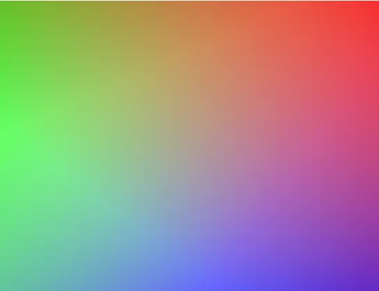
渐变
1 | linear-gradient([angle|to <side-or corner], <color-stop-list>) |
第一个参数可以是 angle,即 [number]deg,顺时针为正值,或者 to 加方向,如 top、right 等,代表渐变的方向。
而 color-stop 可以有多个,可以只有色值,也可以色值+长度或者百分比,代表该颜色渐变的范围/长度,可以是单值也可以是双值,单值代表从什么地方开始,双值代表从什么地方开始和结束,前一个颜色比后一个颜色优先级更高,即不存在后对前覆盖。
示例:
1 | background: linear-gradient(217deg, rgba(255,0,0,.8), rgba(255,0,0,0) 70.71%), |
Z-index
z-index 属性用于控制元素在 Z 轴(即垂直于屏幕的轴)上的叠放顺序。当元素重叠时,z-index 值较大的元素会覆盖 z-index 值较小的元素。
类似于图层的概念。
Pseudo
伪类和伪元素。
Pseudo-classes
:hover:鼠标悬浮:active:点击时:visited:点击后:not():某行为的反行为
Pseudo-elements
::first-letter:第一个字符::first-line:第一行::selection:所选择的文本::before::after::marker
Text-align
设置行内元素的水平对齐方式。
startendleftrightcenter:居中justify:向两侧对齐,对最后一行无效
Vertical-align
设置行内元素的垂直对齐方式。
baselinetopmiddlebottomsub:下标super:上标text-top:父元素的字体顶端text-bottom:父元素的字体底端
ScrollBar
1 | ::-webkit-scrollbar { |
Transform
各个操作间用空格隔开。
Translate
位移。
1 | transform: translate([x-offset], [y-offset]); |
translate()translateX()translateY()
Rotate
旋转。
默认为 rotateZ
1 | transform: rotateX(90deg); |
rotateX():上下翻rotateY():左右翻rotateZ():旋转
Scale
缩放。
scale()scaleX()scaleY()
Skew
倾斜(扭曲)。
skewX()skewY()skew()
Transition
过渡效果。
1 | transition: [property] [duration] [timing-function] [delay]; |
property
可省略,将应用到所有可过渡的属性上。
widthheighttransformcolor
timing-function
easelinearease-inease-outcubic-bezier()
Gap
控制 flex 和 grid 布局中元素的间距。
当只有一个值时,同时应用于行间距和列间距。
当有两个值时,第一个值用于行间距,第二个值用于列间距。
Filter
hue-rotate(deg)
色相扭曲函数。
blur(px)
高斯模糊。
brightness(%)
亮度。
contrast(%)
对比度。
grayscale(%)
灰度。
invert(%)
反转颜色。
opacity(%)
透明度。
saturate(%)
饱和度。
Backdrop-filter
与 filter 类似,但只影响它后面的背景,不影响本身元素。
Pointer-events
pointer-events 属性用于控制元素如何响应鼠标事件。
noneauto
Cursor
cursor 属性用于指定当鼠标悬停在元素上时应显示的光标样式。通过设置不同的光标样式,可以为用户提供视觉反馈,表示不同的交互状态。
default:默认光标(通常是箭头)。pointer:手形光标,通常用于表示链接。text:文本输入光标,通常用于可编辑的文本区域。move:移动光标,表示元素可以被拖动。not-allowed:表示某个操作被禁止的光标。crosshair:十字光标。help:帮助光标,通常用于表示有更多信息可用。wait:等待光标,表示操作正在进行中。- 自定义光标:可以使用 URL 指定一个自定义光标图像。
List-style
list-style 属性是一个简写属性,用于同时设置列表项标记的类型、位置和图像。
list-style-type
none:无标记。disc:实心圆(默认值)。circle:空心圆。square:实心方块。decimal:数字(1, 2, 3, …)。decimal-leading-zero:前导零数字(01, 02, 03, …)。lower-roman:小写罗马数字(i, ii, iii, …)。upper-roman:大写罗马数字(I, II, III, …)。lower-alpha:小写字母(a, b, c, …)。upper-alpha:大写字母(A, B, C, …)。
Pagination
1 |
|
1 | h1::first-letter { |
Dropdown
1 |
|
1 | .dropdown { |
Navigation
1 |
|
1 | h1 { |
Layout
普通文档流
所有元素按照先后位置从上到下布局。
行内元素占满一行后换行,块级元素被渲染为一个单独的行。
这是所有元素的默认定位。
语义标签
headernavmainsectionasideartible
footer
Flex
弹性盒模型。
flex-direction:- 将会改变主轴和交叉轴的方向,默认
row是水平方向上是主轴,竖直方向上是交叉轴。 row/row-reverse/column/column-reverse
- 将会改变主轴和交叉轴的方向,默认
flex-wrap:no-wrap:所有子元素显示在一行。wrap:自动换行排列。wrap-reverse
justify-content:flex-start:左对齐。flex-end:右对齐。center:沿主轴居中。space-between:间隙平分。space-around:每个子元素周围都有相同的间隙,即子元素之间的间隙为子元素到边框的间隙的二倍。space-evenly:子元素之间和边框到子元素之间的间隙相同。
align-items:flex-start:上对齐。flex-end:下对齐。center:沿交叉轴居中。stretch:若元素未设置高度,将占满高度。baseline:基于元素的第一行文字的基线对齐。
align-self:控制单独子元素的对齐方式。flexflex-grow:元素的放大比例,默认为 0flex-shrink:元素的缩小比例,默认为 1flex-basis:元素在主轴方向的初始大小。
为什么没有 justify-items 属性,什么时候可以使用 align-content ?
因为 flex 布局在主轴方向上就是一个块啊,它在主轴方向上没有多个 item 所以它其实就是沿着交叉轴方向的一个一维的直线(默认 flex-wrap 属性值为 nowrap,那它实际上就是一个点,只有当它有多行内容时 align-content 才有意义。
align-content 和 justify-content 是控制多行内容的对齐方式。
注意,当你将 flex-wrap 设置为 wrap 后,即使容器内的元素不足以换行,但还是会被识别为“多行内容”,此时 align-content 会生效。
align-items 和 justify-items 是控制单行内容的对齐方式。
Grid
网格布局。
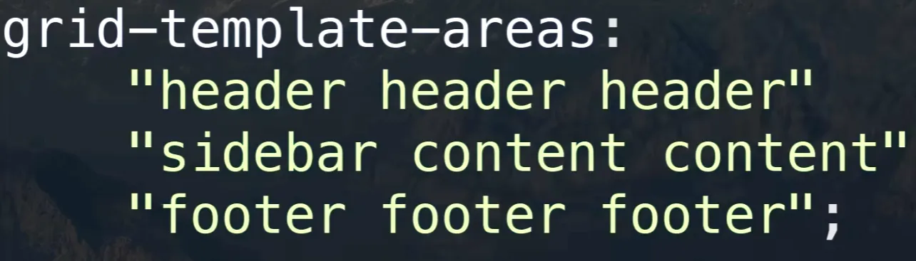
grid-template-rows:行轨道的尺寸。grid-template-columns:列分别的宽度,可以是固定的宽度,也可以用fr表示浮动宽度(特有单位),可以使用重复函数节省编码时间:repeat(3, 1fr)。column-gap:列间距。row-gap:行间距。gap:间距。grid-template-areas:排列元素。- 示例:

- 然后给子元素分别设置
grid-area为header/content/sidebar/footer即可。
- 示例:
align-items:交叉轴方向上对齐。justify-items:主轴方向上对齐。
BFC
Block Format Context
块格式化上下文
可以看作是元素的一个属性,当它拥有这个属性时,可以看作是独立的一个容器,容器里的元素不会影响到外面的元素,它计算高度时会把浮动元素的高度也计算进来,且浮动元素与 BFC 元素区域不会叠加。
如何开启?
- 根元素
<html> - 浮动元素(
float不为none) - 绝对定位元素(
position为absolute或fixed) display值为inline-block,table-cell,table-caption,table,table-row,table-row-group,table-header-group,table-footer-group,inline-table,flow-root,flex,inline-flex,grid,inline-grid,inline-blockoverflow值不为visible的块元素contain值为layout,content,paint的元素- 多列容器
可以避免间距重叠,清除浮动带来的父元素高度塌陷(父元素是由子元素所撑开的,当子元素浮动后脱离文档流父元素便没有高度),避免浮动覆盖。
Animation
keyframes
关键帧动画
1 | @keyframes [name] { |
from 与 0% 等价,to 与 100% 等价。
代表关键帧动画中的一个节点。
然后进行一些操作就可以了。
给元素应用动画:
animation-name:名字animation-duration:持续时间animation-iteration-count:迭代次数animation-direction:动画时间方向normalreversealternatealternate-reverse
animation-play-state:播放状态pausedrunning
animation-timing-function:时间函数曲线可以通过F12调节对应曲线得到相应参数ease-in-out(default)linearsteps([number])
- Title: CSS Note
- Author: Falling_Sakura
- Created at : 2024-04-03 20:52:55
- Updated at : 2024-11-21 10:44:39
- Link: https://vercel.fallingsakura.top/d51d3626.html
- License: This work is licensed under CC BY-NC-SA 4.0.